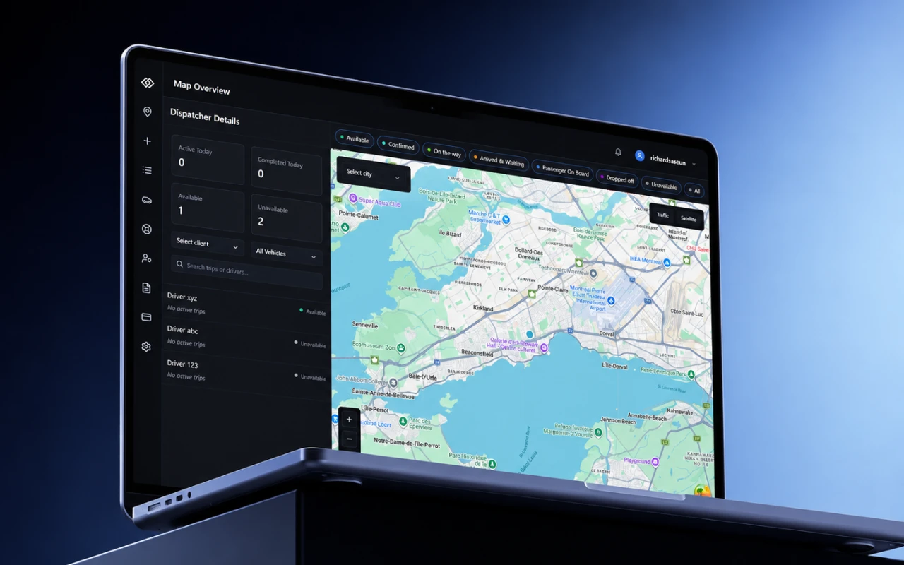
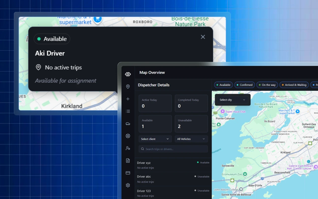
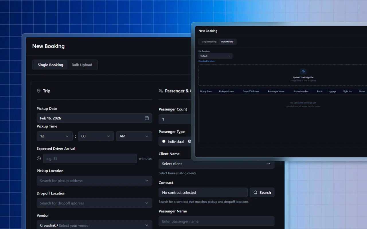
Designed for dispatchers who can't afford to look twice.
The person behind every on-time pickup.
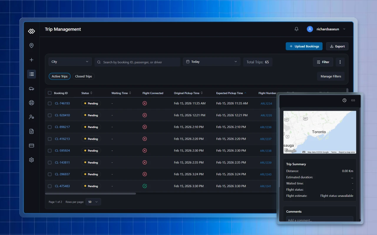
CrewsLink coordinates ground transportation for airlines like WestJet and Air Canada across 37+ airports. The platform moves 24,000+ crew members monthly. Behind that is a dispatcher, someone on screen for 10-hour shifts, managing live trips, tracking drivers, and rebooking pickups in under 4 minutes when flights change.
That person is who I designed for.